Chapter 1
Introducing
Information is power. In today’s world where we have computers that are as powerful as yesterday’s supercomputers, there is a lot of information at our disposal. Being able to convert all this information into useful data is key for many businesses. There are many products available to make this possible and Crystal Reports is by far one of the most popular. Having been around since the mid-80’s and having millions of users, Crystal Reports is probably the most easily recognized name in report writing software.
Writing reports is just one small part of delivering information to business users. With the advance of technology and the Internet, it’s possible to do business with colleagues on the other side of the world as if they were sitting next to you. This has driven business to be much more competitive and complex. Business Intelligence (BI) is the gathering and analysis of data throughout an enterprise to gain a sustainable competitive advantage. In 2003 Crystal Decisions was acquired by the BI enterprise software company Business Objects. Crystal Reports was integrated into a complete suite of tools for tracking, analyzing and managing enterprise data.
As one part of the entire BI picture, Crystal Reports
gives you the ability to gather data from a variety of data sources and present
in native form either on paper or via the computer as well as export it to
external applications such as MS Word or Excel. By giving the layman the power
to pull data from all types of data sources and present it in multiple formats,
Crystal Reports plays a key part in a company’s BI strategy. Crystal Reports XI
is the most user friendly and feature rich version of
What’s New in Crystal
Crystal Reports has exciting new features in it over Crystal Reports 10. In fact, until XI was released many of you reading this book have been using version 8.5 and never upgraded because the changes for version 9 and 10 weren’t significant enough. But with this latest release many people have been upgraded to XI and are looking forward to the new features available. The following sections give you an overview of the new features and tells which chapters have more information about them.
Dynamic and Cascading Prompts
If you are someone who has been using Crystal Reports 8.5 and are just now upgrading to XI, I wouldn’t be surprised to find out that Dynamic and Cascading Prompts are what sold you on the upgrade. Dynamic and Cascading Prompts (DCPs) are a milestone upgrade over the static prompts of previous versions.
DCPs give you two benefits. The first benefit is that the list of values is linked directly to the data source. When the underlying data changes, the list of values is updated to reflect the latest information. The second benefit is that the prompts are linked together. The value(s) chosen in one prompt effect the list of values in the following prompt. The user only sees a list of values directly related to their previous choices.
DCPs improve the usability of parameters by insuring that the data is always current and that the user only sees choices relevant to what they are doing. Chapter 4 covers DCPs in the advanced section.
Dynamic Graphic Location
If you wanted to include dynamic graphics in previous version of Crystal Reports, you either had to embed the images into binary fields within your database or write an application that programmatically loaded the images into memory and placed them on the report. There was no easy way to display images stored on the hard drive of your computer on a report. XI makes dynamic graphic locations possible. By referencing an image via a file path or URL, reports can load new images on the fly and display them on the report. Dynamic images are covered in Chapter 8.
New Export Features
Exporting report output is a very common task. So common that you often find yourself exporting a report in the same way each time. Rather than require you to set the same options each time, Crystal Reports now lets you save default values for the export options. Setting default values makes it faster to export reports and you don’t have to remember which options are best.
A new RTF export format lets you export reports so that it is easier to edit the final output. This ideal for reports that will be used for data entry forms. You could export to RTF prior to XI, but the format was optimized for precise formatting. Editing the RTF wasn’t very practical. You now have a choice between exporting that is optimized for editing or optimized for precise formatting. Exporting is covered in Chapter 14.
Parameterized Sorting
The sorting of groups and Top N/Bottom N reports now have a Formula Workshop button associated with them. Conditional formatting formulas can be used to change the sort order. By integrating this with parameters, the user gains more control over their report output. Sorting and grouping is in Chapter 3.
Hierarchical Grouping Improvements
Hierarchical reports used to be very limited in how the final output looked. Each column was formatted using an indented tree format and sometimes the report was so easy to read. XI gives you an improved set of formatting functionality that increases how much control you have over a report’s final output. You control the indentation of report objects and the grouping sections. This is covered in Chapter 3.
HTML Preview
A new tab in the report designer lets you view reports in their HTML format. This gives you immediate feedback about how accurately your reports will appear when viewed as a web page. HTML preview is only available when using Business Objects Enterprise or the Report Application Server. This is not covered in the book.
Workbench
The Workbench makes it easy to organize multiple reports into folders. By organizing reports into specific categories you can easily find the reports you need and manage them. You can also use tools such as the Dependency Checker across all the reports in a folder. The Workbench is covered in this chapter.
Application Designer Improvements
Programmers have many new improvements to look forward to after installing XI. Programmers now have more control over their reports, better integration of Java functions, client-side web printing, and improved report design. Although this book doesn’t include programming specific topics, this is covered in extensive detail in Volume 2 of this series, “.NET 2005”.[1]
Note
If you are using Crystal Reports for .NET 2005, you need to install Crystal Reports XI Release 2. Crystal Reports XI was released almost a year prior to .NET 2005 being released and they are not compatible with each other. Thus, there is a new version of Crystal Reports XI that is compatible with .NET 2005. You need to download and install XI Release 2 from the Business Objects Dev Zone website.
Getting to know Crystal
This chapter starts out simple by giving you an overview of how Crystal Reports works. The first tutorial uses the report wizard to create an Employee List report and print it out. After printing the Employee List report, the different features of the Report Designer are explained so that you have a thorough understanding of how to work with Crystal Reports. Lastly, the features of the report wizard are explored in more detail.
Opening the Start Page
After opening Crystal Reports you are presented with the Start Page. The start page is brand new for version XI. The goal is to make it easy for you to either open the most recent projects you are working on or find out the latest news and updates about Crystal Reports. The majority of the page consists of links you to online sample reports, important help topics, and the support page. In the middle of the page are links to create a new report with each type listed individually. The right column shows a list of the most recently used reports.
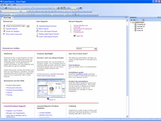
Figure 1-1. The Start Page.
An important new feature to the start page is the Workbench. The Workbench is useful for managing a large number of reports. Within the Workbench you can create projects and each project has multiple reports in it. By grouping reports into different projects it becomes easier to manage where the reports are and how they are related to each other. If you use Business Objects Enterprise, with one click of the mouse you can publish an entire project to the enterprise software so that reports can be viewed anywhere with a Web browser.
The Report Designer
The Report Designer lets you design reports by adding report objects, formatting the report layout, modifying database connections, etc. It’s where you spend the majority of your time when using Crystal Reports. If you’ve used previous versions of Crystal Reports then you are very familiar with the Report Designer.

Figure 1-b. The Report Designer.
Along the top of the screen are the different toolbars. These toolbars are Standard, Formatting, Insert, Wizards, and Navigation. By default all of them are displayed when you open the designer the first time. You can rearrange them or disable the ones you don’t normally use.
The majority of the screen consists of the report being worked on. Along the top is the tab showing the report title as well as the tabs of any other reports open. Below the tab is the report in design mode. It shows each report section (Report Header, Page Header, Details, etc.) and the report objects in each section.
Along the right side of the screen are windows displaying different characteristics of the report and design environment. The top-most one is the Workbench that was discussed in the last section. Below the Workbench is the Field Explorer and the Report Explorer. The Field Explorer shows the different fields that can be displayed on a report. These can be database fields, formula fields, parameters, etc. The Report Explorer displays each part of the report and lists every report object in each section. For complex reports displaying many objects, this makes it easy to get an understanding of what is displayed on a report without letting the placement of the objects confuse things.
Previewing Reports
The Report Designer also gives you the option to preview a report while working on it. Right below the tab that displays the report name are two tabs with Design and Preview on them. Clicking on the Preview tab shows you what the report looks like when it gets printed out. If the Preview tab isn’t shown, you can click on the Print Preview button to display it.
![]()
In preview mode the left side of the screen becomes a group selection tree that lets you jump directly to a specific group on the report. In the middle of the screen is the report as it looks when printed out.
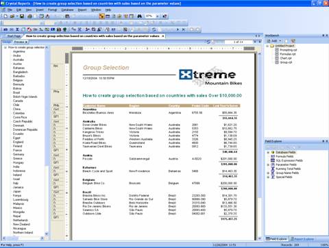
Figure 1-x. Report preview mode.
Tutorial 1-1. Printing Your First Report
This lesson walks you through the steps of creating a new report. You will use the Report Creation Wizard to make this as easy as possible. When you are finished you will have created and printed out a simple report that shows employee names.
1. Open Crystal Reports and make sure you are on the Start Page.
2. Click on the Standard Report Wizard link.
3. This is the first option under the New Reports column in the middle of the page.
After clicking on this link the Standard Report Creation Wizard opens. This wizard walks you through the steps of creating a new report. The first step is to select the data source.
4. Double-click on the Create New Connection folder to expand it.
5. Double-click on the Access/Excel (DAO) selection. This opens the Access/Excel (DAO) dialog box that lets you find the file to use as a data source.
6. Click on the button to the right of the Database Name textbox and navigate to the Xtreme.mdb database. It is located at:
C:\Program Files\Business Objects\Crystal Reports 11\Samples\en\Databases\xtreme.mdb.
7. Click the Ok button to select this database.
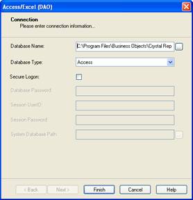
Figure 1-x. Selecting the Xtreme.mdb database.
8. Click the Finish button to close the dialog box.
9. Expand the Tables selection to see the tables in the database.
10. Click on the Employee table name to select it.
11. Click on the Right arrow to move the Employee table to the Selected Tables list.
12. Click on the Employee Addresses table name to select it.
13. Click on the Right arrow to move the Employee Addresses table to the Selected Tables list.
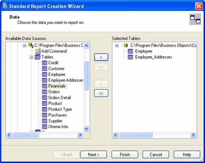
Figure 1-x. Selecting the database tables to work with.
14. Click the Next button at the bottom to save the tables.
The Link dialog appears showing you the field(s) the two tables are joined by. In this example the Employee Id field links the Employee table to the Employee Address table. You’ll learn more about linking tables in the Chapter X on databases.
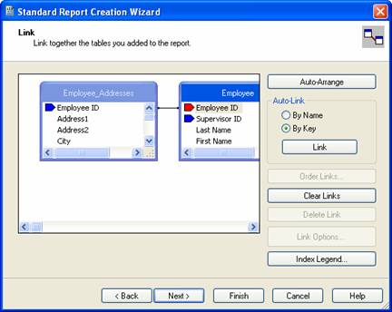
Figure 1-x. Linking the two tables by the Employee Id field.
15. Click the Next button to accept the default link. The Fields dialog appears showing all the fields from each table. Moving fields from the Available Fields list to the Fields to Display list on the right adds the fields to the report.
16. Click on the following fields and then click on the Right arrow button to move them to the Fields to Display list: Employee Id, Last Name, First Name, City, and Region.
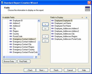
Figure 1-x. Selecting the fields to display on the report.
17. Click the Next button to save these fields.
The Grouping dialog appears showing the fields that were selected in the previous step. We’ll look at grouping and sorting records in Chapter 3. Click the Next button for now.
The Record Selection dialog determines which records from the database get displayed. We’ll cover this in more detail later in the book and not make any changes for this tutorial.
18. Click the Next button to move forward.
The Template dialog appears so you can choose from a list of pre-determined report formats to make a report look good. Crystal Reports comes with over a dozen different styles to choose from. As you click on each template the preview area to the right shows an example of what the report would look like.
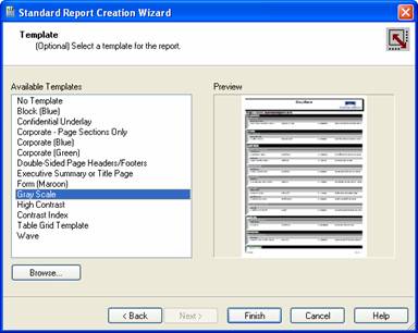
Figure 1-x. Selecting a template for your report.
19. You can select one of the templates to automatically format your report to look a certain way. In this example click on the No Template option to keep things simple. You can go back later and play with what the other templates.
Crystal Reports creates the report and automatically previews it for you.
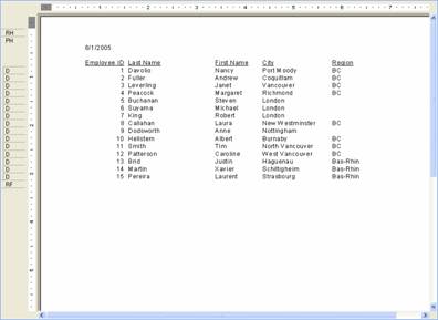
Figure 1-x. Employee List preview.
Overall, the report doesn’t look too bad. Some things you might notice right away is that the Business Objects logo is displayed in the report header. Of course, in your own report you will customize the report header to have you own corporate logo, but we’ll discuss how to do that later. Another thing to notice is that the report title is simply called Report1. This isn’t a very descriptive name and you definitely need to change it so that you can remember what the report does in the future.
20. On the application menu select File | Summary Info. This opens the Document Properties dialog.
21. Enter Employee List as the title.
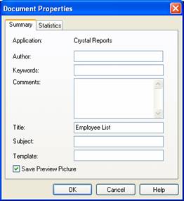
Figure 1-x. Changing the report’s title.
22. Click the Ok button to update the report tab.
23. On the application menu select File | Print to print the report. The report will print out on your default printer.
24. Save report as Employee List.rpt.
25. If you want to make more changes to the report’s design, click on the Design tab above the report. This shows each section of the report and the report objects in each section. We’ll cover the details of modifying the report design throughout the book.
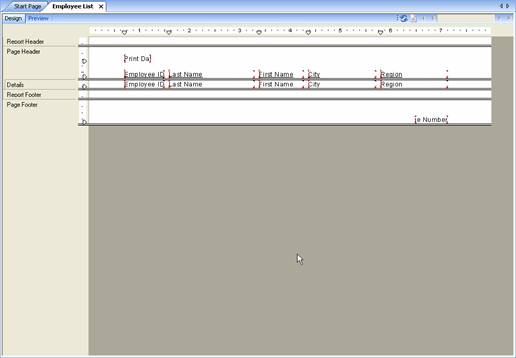
Figure 1-x. The Employee List report in design mode.
Getting to Know the Designer
The report designer is the workbench where you create reporting magic. With it you design new reports, modify existing reports, write formulas, preview reports and print them out. It gives you all the tools necessary for designing hundreds of reports. Figure 1-a1 shows the designer and its various windows. I opened the Customer Profile sample report that comes with Crystal Reports.
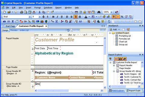
Figure 1-a1. The report designer.
There are 7 parts of the designer that are important: the toolbars, dockable windows, the Workbench, the Report Explorer, the Field Exporer, the report designer, the report preview. Each of these are explored next.
Managing the Toolbars
The toolbars are located directly below the menu options listed along the top of the designer. The toolbars make it easy to access the different designer features by the simple click of a button. Most buttons either perform an action or make a change to the currently selected report object. Some of the actions that are performed by buttons are opening a new report, saving the report, adding a chart to the report, or opening a report wizard. Some of the changes that can be made to report objects are changing the font, formatting a number as currency, and aligning text to be left or right justified.
You have control over which toolbars are displayed and where they are located. By default when you first install Crystal Reports all the toolbars are displayed. But if you’re like me, I like to maximize the amount of space available on my screen and I always rearrange my toolbars and turn off the ones I don’t want. To do this right-click anywhere on one of the existing toolbars and the context-sensitive menu pops up.

Figure 1-x. The Toolbar menu.
The menu shows each toolbar available and there is a checkbox to the left of each toolbar currently displayed. Click on the toolbar name to toggle it on or off. This automatically updates the toolbar and closes the menu.
On the left side of each toolbar are a line of vertical dots. These are used to grab the toolbar and move it around. By moving the cursor on top of these three dots the mouse cursor changes to a navigation cursor. Hold down the mouse button and drag it around until the toolbar is in the place you want and release the mouse.
![]()
The Status Bar at the bottom of the designer is also classified as a toolbar. It shows the report object currently selected, its report coordinates, the modification date, and the number of records to be displayed on the report. Just like the other toolbars, the Status Bar can be turned off as well. However, it can’t be moved around. It has to stay at the bottom of the designer.
Any changes you make to the toolbars are saved and will be in effect the next time you open Crystal Reports.
Dockable Windows
The next few sections of this chapter discuss the different windows located within the designer.: the Workbench, the Report Explorer, and the Field Explorer. When you first install Crystal Reports, each window is located in a particular place within the designer. If you want to personalize your workspace then you can move them to another location within the designer. You can also close any window so that it isn’t visible anymore. Here are a few tips for working with the windows.
If you want to move a window to a new location, click on the top bar along the window and hold down the left mouse button. While holding down the mouse button move the mouse to where you want the window to move to. You will see a gray box “jump” around the screen showing you where the window will be. Once you are happy with the location let go of the mouse and the window will be “dropped” on that location.
If you want to remove the window from the designer, click on the “X” icon in the top right corner. This closes the window. If you later decide that you want the window back (or you clicked the X by mistake), then go to the menu and select View. Within the submenu is a list of all the windows. Click on the one you want and it will become visible again.
I find that people are generally happy with the default window locations and don’t want to change them. However, what happens is that they accidentally click on the window while moving the mouse aournd and “magically” reposition the window to some random place. If this happens to you then you just entered “Window Hell”. I say that because it seems almost impossible to get those windows to go back to where they were. No matter how many times you drag them back to where they should be, they end up someplace else. I wish I had some easy tips to pass on to make this easier, but I don’t. I struggle with it more than I care to admit. For example, when I try to move the Workbench back to the top right corner it somehow ends up either spanning along the top of the screen or being beside the bottom right window and taking up too much space. I think its more luck than skill.
In the ideal world, the Undo menu option would work for windows as well. You could click Undo and the window would go back to where it used to be. Unfortunately, that isn’t the case and you have to move the window back manually.
One feature I really like about windows is that they can be hidden but still be visible on the screen. If you look at the top of the window you’ll see a thumbtack icon on the right side. This is the “Auto-Hide” icon – it makes the window is visible only when you need it. Clicking on it causes the Auto-Hide feature to be toggled on or off. When Auto-Hide is on, the main portion of the toolbar is invisible and only the title bar is shown along the right side of the screen. To make the window visible, simply let the mouse hover above the title bar and it will appear again. When you take the mouse away from the window it goes back to hiding.
The Workbench
Do you work with so many reports that it’s hard to keep track of all of them or even remember for whom or the which department they were created for? The Workbench, located on the top right portion of the designer, makes it easy to organize and categorize a large number of reports. Within the Workbench you create new projects and associate reports for each project. A project can group together reports from an internal project (Market Analysis from Annual Survey), reports related to specific departments (Payroll Department), reports related to specific applications (SAP Accounts Receivable), etc. You can also nest projects within each other if you have different hierarchies of report classifications.
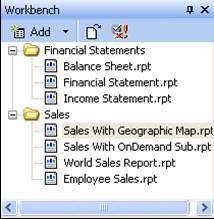
The benefit of using projects is that when you are working on reports within a project you don’t have to worry about the dozens of other reports stored on your computer. By keeping them displayed within the Workbench you can quickly edit and swap between different reports. You can also perform functions across all reports in a project such as running the Dependency Checker.
Reports are added to the Workbench in two ways. The first way is to right-click anywhere on the Workbench and select Add | Add Existing Report. The second way is to drag a report from Windows Explorer and drop it onto the Workbench area. You must move the cursor onto the Project’s name so that the name gets highlighted. Otherwise it will only open the report in the designer and not add it to the project. If you later decide to delete a report from the project, it only removes it from the Workbench area and does not delete the physical report file from your computer.
Another benefit of the Workbench is that it lets you check for dependencies within all the reports in the project. Checking for dependencies is described in more detail in Chapter 5, but it scans through all the report objects and verifies that all the hyperlinks and report formulas are valid.
The Report Explorer
The Report Explorer shows a snapshot of every report object on the report. This lets you browse through all the report objects in a hierarchical tree structure and look at each section and see every object within that section. By clicking on the + or – next to the section name you can expand or collapse the section details. Figure 1-a2 shows the Report Explorer with the Group Header #4 section expanded.
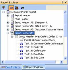
Figure 1-a2. The Report Explorer window.
The Report Explorer is organized so that the report name is listed at the top of the tree. Below the report name are the different report sections. Within each report section are the report objects shown in that section. When you click on the report object’s name, the designer automatically highlights that object and repositions the window so that you can see where it’s at. And what is even better is that the report designer shows you where they are located and their position with respect to the other report objects. This makes it easy to locate a report object within a complex report with dozens of other report objects.
Note
You can delete objects from the report using the Report Explorer, but it doesn’t let you add new objects.
Since everything listed in the Report Explorer can be overwhelming for complex reports, there are buttons to filter the list down to a more reasonable size. Along the top of the window are three buttons for filtering items. The first filtering button, Show/Hide Data Fields, toggles the display of the data fields in the report. Considering that 95% of all report objects are classified as data fields, this removes most items from being listed. The effect is that you only see the section names (Group Header, Details, etc.) and a few other objects within the sections like lines, subreports, charts. The second filtering button Show/Hide Graphical Objects, toggles the display of lines, shapes, images, and charts.The third filtering button, Show/Hide Grids and Subreports, toggles the display of Crosstab objects and subreports.
An example of using the filtering buttons is to locate all the images on a report. By turning off the display of data fields and Crosstabs, you can scroll through the sections and immediately see which ones display images and what those images are.
The Field Explorer
The Field Explorer gives you a list of all the available database fields, formulas, parameters, summary fields and special fields. The Field Explorer serves two purposes. First is that you can see and edit the different fields on the report. For example, the Database Fields shows you which fields are part of the data connection that the report uses. The Parameter Fields shows you which parameters the user will be asked to enter when the report runs. When given a report that was designed by someone else, you can scroll through this list and get a good idea of what the purpose of the report is and determine its complexity. The second purpose of the Field Explorer is to be an easy way to add objects to the report. By dragging and dropping a field from the Field Explorer to the report designer, the object is added to the report. You will become very familiar with the Field Explorer because it is the primary means of building reports.
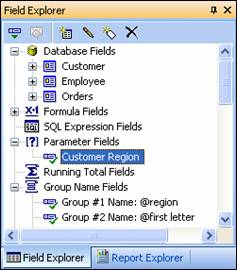
The Field Explorer also makes it easy to add Special Fields that you otherwise might forget are available (e.g. Page N of M, Current Date, Report Title, etc.). These are the last items listed in this window. Make sure you familiarize yourself with this list before building a report.
Another benefit of the Field Explorer is that it puts a check next to the fields used on the report. You can quickly see which fields have already been added to the report and which ones still need to be added. You might find it interesting to know that it puts a check next to a field that isn’t directly used on the report, but is being using in a report formula. For example, say you create a formula that uses the Customer Id field. Once you drag that formula onto the report, a check appears next to the Customer Id field. Personally, I would like to be able to click on a field and have it show me where the field is located on the report. If the object was on the report more than one time, then each click would navigate to the next instance. This would be similar to how Report Explorer navigates to selected objects, but with the Field Explorer I don’t have to know which section an object is located in prior to selecting it. Maybe we’ll see that in a future version?
Have you ever worked with a report someone else designed and you aren’t familiar with the fields in the database or the data they contain? The Field Explorer lets query the database and see the values stored in each field. Right-click on the database field you want to examine and select Browse Data. A window pops up that tells you the field’s data type and lets you scroll through the data stored in that field. If you just want to see the field type, right-click on the field and select Show Field Type.
Along the top of the Field Explorer window are shortcut buttons for common tasks. These buttons are enabled or disabled depending upon whether they are compatible with the object currently selected. The first button, Insert To Report, lets you drop the report object onto the report. This is another alternative to dragging and dropping the object onto the report. The second button, Browse, is enabled when a database field is selected. It lets you browse the field is data as mentioned previously. The next four buttons are used for creating and editing formulas and parameters. The buttons lets you either add a new object, edit an existing object, or delete it altogether.
The Report Designer
If creating reports were an art, the Report Designer would be your canvas. It’s where you place the report objects, change colors or fonts, and set the layout of the report. The details of using the report designer are covered in much more detail in the next chapter and throughout the rest of the book. For now we can cover some of the basics.
Along the left side of the designer are the different sections of the report. A basic report always has the sections Report Header, Page Header, Details, Page Footer, Report Footer. Later in the book you’ll see how to work with sections to create advanced reports.
Along the left and top border of the designer are rulers
that are used for positioning objects on the report. The default units that the
ruler displays is controlled by the regional settings of your operating system.[2]
For example, if the regional setting is ‘English (
Notice the little triangles along the top ruler? These are markers for guidelines. By attaching report objects to a guideline, you can reposition the guide line and all the attached objects move with it. This lets you place multiple objects along the same column and if you need to later move the column then all the objects will stay lined up. Guidelines are discussed in more detail in the next chapter.
The center of the designer shows the report objects and where they are located on the report. As you move the cursor around the report designer you’ll notice that the outline of each object is highlighted as the mouse passes over it. For a complex report with many overlapping objects, this lets you clearly identify the boundary of each object.
Report Preview
The Report Preview shows you what the report looks like when sent to the printer. This makes it easy to see if whether what you built in the Report Designer meets your expectations. The Report Preview uses live data so that you have an accurate presentation.
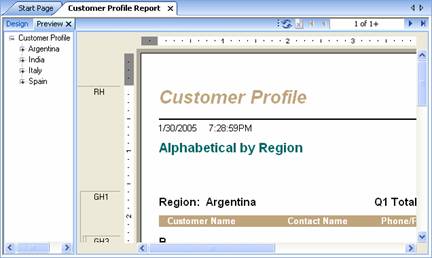
The leftmost portion of the preview tab is the Group Tree window. This shows you all the groups in the report. Click the + sign next to the group name to expand the sub-groups or see the detailed records.
The top-right portion shows the navigation toolbar. By clicking on the arrows you can navigate to the next page, the previous page or even jump to the first or last page in the report. There is also a button to refresh the report data as well as stop querying the database for new data.
An interesting aspect of the Report Preview is that it lets you make changes to the report as if you were still in the designer. It only allows for simple changes, but you can make changes nonetheless. For example, you can move an object around the report and immediately see the effects on all the pages. You can also change the formatting of each object. Making changes while previewing the report is much faster than switching back and forth between design and preview modes.
Since the Report Preview allows changes to be made, it has a few aspects of it that are in common with the Report Designer. Along the left side of the preview window are the section names. This lets you see how the report objects are associated with each section. This is helpful for complex reports that have nested groups as well as sections that are conditionally hidden. By being able to determine which section a report object is displayed in helps determine whether groups are displaying the proper data or see if sections are being hidden at the appropriate time.
Along the top and left edges of the Report Preview is the ruler. Since you can move objects around the report in preview mode, it makes sense to see their location on the ruler. This is especially useful for reports used with pre-printed forms and exact placement is critical.
Understanding the Report Wizards
The report wizards make it easy to create almost most types of reports. By selecting your data source and clicking on a few buttons you will quickly create a new report.
Depending upon your needs, creating reports can be a simple or complicated process. For example, it is very easy to print mailing labels from an address database or print a form letter to a list of subscribers. On the other hand, it can be very complicated to write a report that uses multiple sub-reports which are based off of user entered parameters. Fortunately, the report wizards that come with Crystal Reports make it easy to quickly produce a variety of reports. The wizards are useful for writing complex reports because they give you a way to quickly make a professional looking report that you can later customize for your specific needs.
Since wizards are designed to be easy to use, you might be wondering why this chapter needs to explain them. The problem with wizards is that although they are supposed to be simple to use, a tool that is simple is generally not very useful. As a result, today's applications use wizards that are designed to achieve many tasks and sometimes require explanation to clarify advanced functionality. This gives you the best of both worlds: a simple to use interface with extra features for advanced users.
Each wizard consists of a multi-tabbed dialog box. Many of the tabs on each wizard are used elsewhere within the main functionality of Crystal Reports. This chapter summarizes each tab and the details are covered in later chapters where applicable.
Using the Wizard’s Dialog Boxes
Each report wizard uses a combination of different dialog boxes to question you about how to build your report. Each wizard presents a slightly different combination of these tabs. This section describes how to use each dialog and explains any aspects of it that may not be obvious. The report wizard dialogs are called Data, Links, Fields, Grouping, Summaries, Group Sorting, Chart, Record Selection, Template, Drill and Mailing Labels.
The Data Dialog
The Data dialog is the first dialog box presented. It lets you select the database and tables that store your data. The database can be a standard data source such as SQL Server or a non-standard data source such as an Excel spreadsheet.
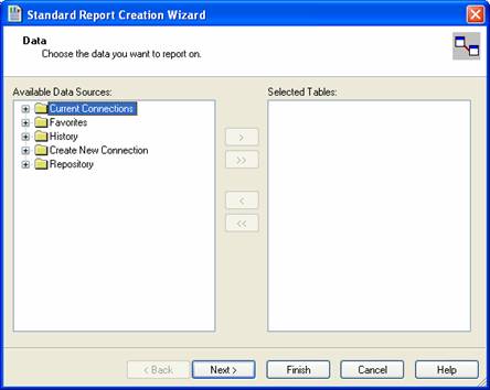
Figure 2-2. The Data dialog of the report wizards.
The Links Dialog
Reports that use two or more
tables need to have the tables linked so that data can be pulled from both of
them. The Links dialog lets you set the fields for creating relationships
between the tables. Crystal Reports attempts to automatically link the tables
together. If two fields have the same name and the data types are compatible,
then

Figure 2-3. The Links dialog of the report wizards.
The Fields Dialog
After selecting which tables you want to use for your report, the Fields dialog allows you to select which fields will be shown. Adding and deleting fields is done in the standard manner of dragging and dropping them between windows or selecting a field and clicking on the appropriate arrow button.
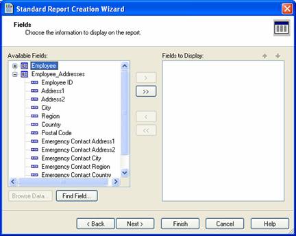
Figure 2-4. The Fields dialog of the report wizards.
After you add all the necessary fields to your report, you are free to reorder them by using the arrow buttons above the window. The order that the fields are listed in is the order that they will be shown on the report. Select the field to move and click the up or down arrow to reposition it.
The Grouping Dialog
Some reports have so much data on them that they can be a little hard to understand. When reports are dozens or even hundreds of pages long, you need to organize the information in a way that makes it easier to absorb the data in smaller pieces. You do this by creating groups within the report. Groups can be based on many things. Some examples are grouping on months of the year or the names of the different branch offices for a company.
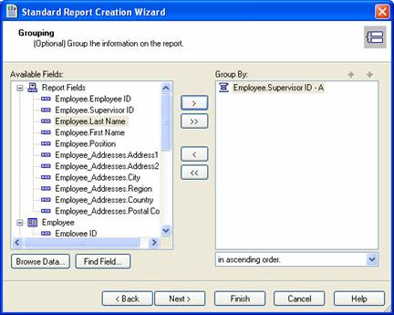
Figure 2-5. The Groups dialog of the Report Wizard.
The Summaries Dialog
It is very common for reports to calculate sub-totals and other summary calculations on the numeric fields. The Total tab, shown in Figure 2-6, is where you define the summary calculations for the different fields. The left listbox shows all the available fields. The right listbox shows the fields that will have summary functions calculated for them.
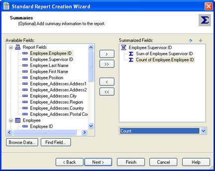
Figure 2-6. The Total dialog of the Report Wizard.
The Group Sorting Dialog
When adding a group to a report, you probably assume that every record within the group will be displayed. In most circumstances this is the case. However, you can tell Crystal Reports to only display a certain number of records based upon their rank. For example, you could have a top salesperson report where you show the top 10 salespeople in your office. You could also have another report that shows the worst 10 salespeople. The Group Sorting dialog lets you do this by sorting the groups based on a summary field
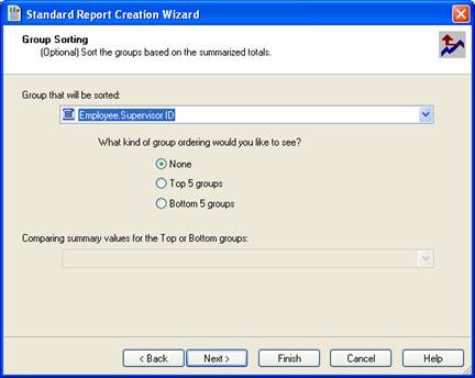
Figure 2-7. The Top N dialog from the Report Wizard.
The Chart Dialog
This dialog lets you add a chart to your report. You can also set a variety of options for what type of chart to display and how to display it.
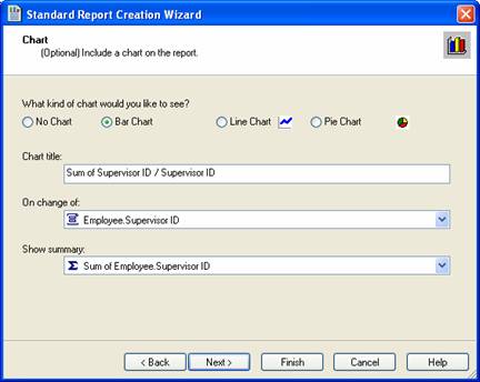
Figure 2-8. The Chart dialog from the Report Wizard.
The Record Selection Dialog
Some reports need to only show a sub-set of all the data that is in a table. For example, a financial report may only show the corporate data for a single quarter or a range of quarters. To filter out certain data so that you limit how much information is shown on a report, use the Record Selection dialog shown in Figure 2-9.
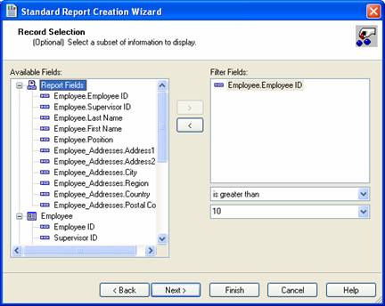
Figure 2-9. The Select dialog from the Report Wizard.
The Template Dialog
After specifying the report details, use the Template dialog to format everything so that the report has a professional look to it. This dialog, shown in Figure 2-10, lists over a dozen different pre-determined templates that can be applied to your report. These templates make it easy for you to take some raw data and spice it up enough to make everyone think you worked really hard to create the report!
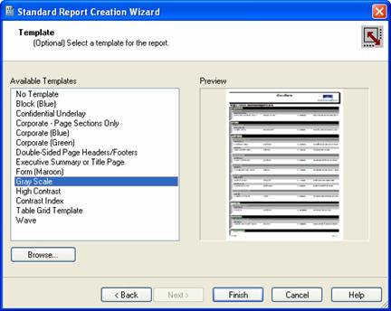
Figure 2-10. The Style dialog from the Report Wizard.
The Cross-Tab and Customize Style Dialog
The Cross-Tab and Customize Style dialogs are only available when using the Cross-Tab Wizard. They let you modify the cross-tab data for what appears in the rows and columns. Modifying these tabs is very involved and is explained in detail in Chapter 12.
The Drill Dialog
The Drill dialog is only available when using the Drill-Down Wizard. When creating drill-down reports, you allow the user to see a summarized view of their data. If they want to examine the data in more detail, they can expand a record to see more detail relating to the summarized information. The summarized fields are listed on this tab. When you click on the field's name, it will toggle it back and forth between "Show" and "Hide". This will alternate the default of whether it gets displayed or not.
The Mailing Labels Dialog
The Mailing Labels wizard is very simple. After selecting the database tables and fields that are displayed, it lets you select the label size. You can choose from a list of the standard Avery labels or choose a User Defined Label.
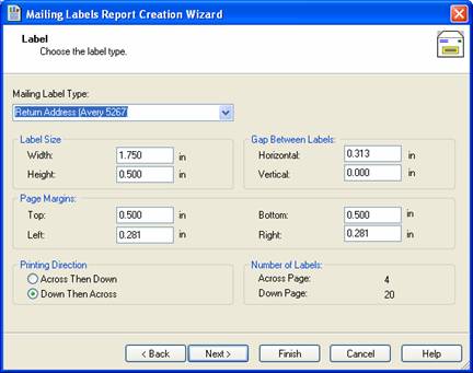
Figure 1-x. Mailing Labels dialog of the Report Wizard
In the middle of the dialog box are the various settings for how the labels are sized and the gaps between each label. At the bottom you select whether you want the labels to go across the page or down the page in a column. The bottom right corner gives you a general idea of whether you entered the parameters properly by calculating how many labels are printed per page.